The blunt truth, from across the pond.
Working as a designer for over a decade, you get to work with all different types of clients. While each experience is different, many share some ill-attributes. Overly-controlling, insistant on their input, and honestly design-inhibiting. Which means only a select few get the best out of their designer.
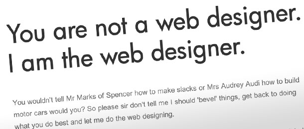
[dropcap3]Y[/dropcap3]et, most of the time we designers never set ground rules. Especially not as blunt as my friend Dan here has put it. And I have to cheers him for putting it together so well – don’t be insulted, look at is as good insight.
Designers have a lot to focus on. The target audience, the design, the architecture to function properly, staying under budget, the list goes on and on. All the while keeping the client whom is paying our bills very happy; to the point where it can hurt your project. In truth, many clients don’t have faith in their designer – and we constantly get clients who put their own opinion in as if it were the greatest ideas ever. Then are confused why their work isn’t in our portfolio, and doesn’t look as good as the other projects we’ve done.
Have faith in your designer – we’ve gone to school for this, we’ve been doing it forever, and every waking hour is spent thinking in a design mentality. You will always get a better product if you let the specialist do his job vs. micro managing.
http://www.alittlebitofsomething.co.uk/
Some of my favorite clients to work with have been fellow artists. They understand we have a specialty, which is what they’re hiring us for.
Some helpful ground rules:
[dropcap2]1[/dropcap2] The logo doesn’t need to take up half the page. Yes, you want to be known, but look at any corporate website for a company pulling in millions each quarter, and notice the logo is not a billboard on their homepage.
[dropcap2]2[/dropcap2] You don’t need the brightest complementary colors. You want to get someones attention, but that doesn’t mean you want to look like a fast-food restaurant. They choose their colors to get you to come in hungry and leave immediately – is that part of your business model?
[dropcap2]3[/dropcap2] Your artwork doesn’t need to have every graphic effect possible. It’s the best way I can put it for a trend going on right now – jelly logos, lots of shadows, emboss everything or gradient it. Around the year 2000, this trend started where logos started looking like they’re wrapped in cellophane. Yes, it was a trend, trends last ~10 years, and the movement is on the way out. You don’t want to look dated in a year or two.
[dropcap2]4[/dropcap2] You don’t need to put in your opinion, just to add something. Everyone likes to have their voice heard, and put in insight. But quite often, we’ll show a design looking only for approval, only to get a myriad of subtle changes that really adds up – in your final cost. If it looks good, approve the design and let us continue to design beautiful work. Chances are all your subtle changes will frustrate the designer and the project will suffer – the design we painstakingly laid out is getting butchered because you want to add “your own touch” – or worse, you don’t know what you want, so you want to see how something looks 15 different ways while you figure it out.
